What Six Months Look Like If You Have Been Busy
So I promised an explanation on what I did the weeks before the deadline and how the project went as a whole. I will try to include as much pedagogic help as possible but this will be a read and not a kindergarten post.
Last time I posted I was working on a title named <Lonely Road>. I’ve been working as a practice lead designer position on a six man team. I had worked with this team before and I felt we could achieve something great during this project. We dove headfirst in one of my ideas and almost dove in motivation and co operation during the last week. The programmers finally decided so stick with it and created this game
Logo
Our programmer Laban Melander made this picture. We had our share of artists and Laban is even a skilled programmer,
winning numerous prizes the project after this one.

Intro Screen
We made is simple with only a small tinted text in order to enjoy the art in this game. If you have sound on
you can hear a small fire crackling. Our artists Seamus Newman made this.

Main Menu
We tried to make it as simple as possible considering the game has very little enjoyment offered. My tip here is to
never ever go overboard on the MainMenu, it can easily confuse and intimidate the player(looking at you Starcraft).

HighScore
So this is one of my own creations. Never had I failed so badly that I couldn’t make a billboard.
I really tried making this with buttons but I didn’t use enough time effectively so this is the shit you get to watch.

Options
This page was made by our lead programmer, also a talented artist named Viktor Myhrberg. From the north he never saw
Color until he was a grown man and you can tell he has grown fond of it. Everything is shown perfectly with sliders instead
of a designated point system which usually these are handled in but I actually like this old school scrolling better, it makes for
a better equalizer feeling. At the bottom you can see the button which changes between special controls and normal controls.
This was put in so everyone can enjoy the game immediately.

The Turorial
We were split between showing a fake loading screen where you become introduced to the game via slides but skipped it for this
monstrosity. In my honest opinion I would have gone in a different route but the design was so nice I was happy it got implement
anyway. On the left hand side you can see your objectives and motivation for playing. It shows everything you really need to know about the game first hand. The middle shows you the special controls and the left hand side gives you an introduction on the monetary system in the game. Everything you need for a good start is there. Considering nobody reads these stuff it was paramount to make the player understand the mechanics in the game without looking at a picture for longer than two seconds. We implemented feedback as soon as you had enough score to show people what the game had to offer if you became worthy of an upgrade. It is only a shame we never told the player that this is a wave defense top down shooter before he or she started playing.

GamePlay
And here we are, gameplay. Bandits come from random locations and you have to kill them all. Upgrade with your score and make sure your truck’s HP never falls below 0.

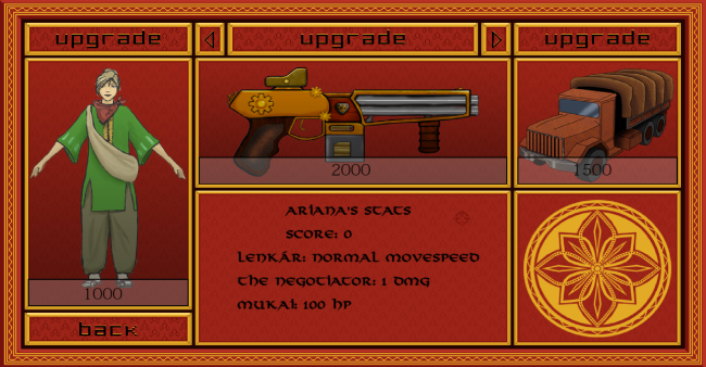
Customization Page
You can see why I was happy working with this team. This customization page is a beauty I am happy that we implemented this way. From pixel graphics you get a cleaner more detailed look at your world here.
So this is Lonely Road. One of the few finished games that course. I liked the game but I am unhappy our group went the way it went. it is great to hear that the students I worked with did absolutely great the next project.
So that was that project. I’ll make a new post about the game we made on the course Theme Park and I will share some ideas I’ve been having.
